[](https://github.com/ParadeTo/vue-tree-list/actions)
# vue-tree-list
A vue component for tree structure. Support adding treenode/leafnode, editing node's name and dragging.
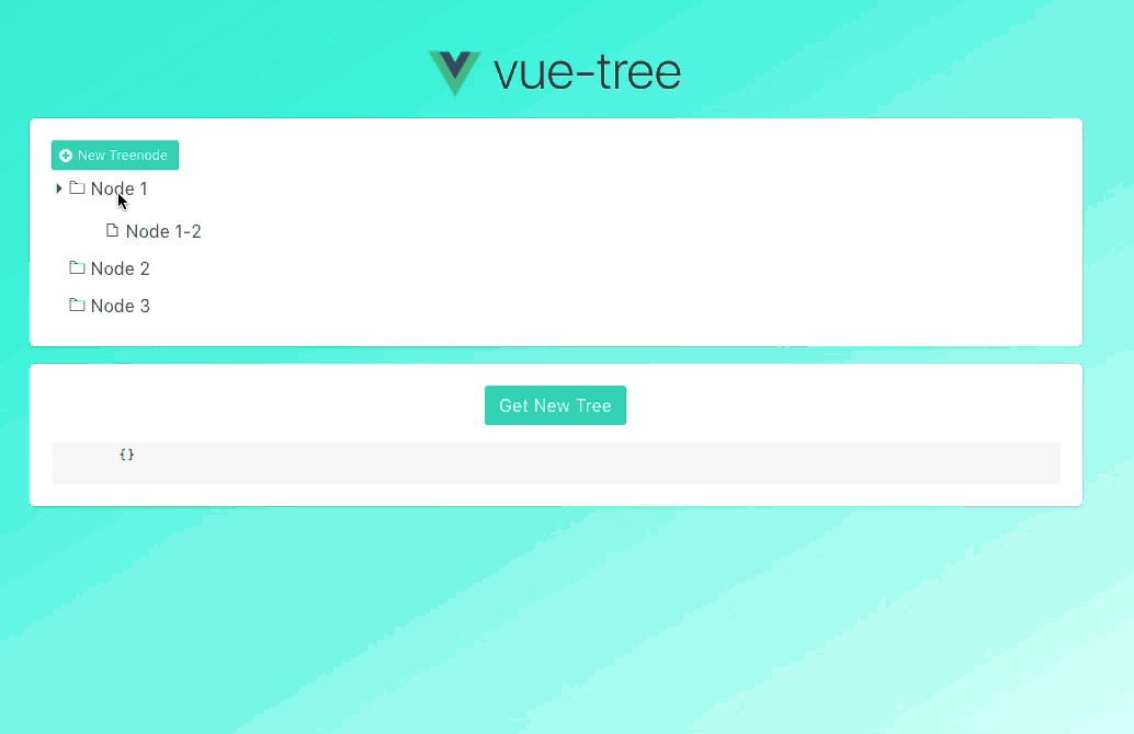
[Live Demo](http://paradeto.com/vue-tree-list/)
# install
Install the plugin then you can use the component globally.
```js
import Vue from 'vue'
import VueTreeList from 'vue-tree-list'
Vue.use(VueTreeList)
```
Or just register locally like the example below.
# use
`npm install vue-tree-list`
```html
```
# props
## props of vue-tree-list
| name | type | default | description |
| :--------------------: | :------: | :-----------: | :-----------------------------------------------------------------------------------------: |
| model | TreeNode | - | You can use `const head = new Tree([])` to generate a tree with the head of `TreeNode` type |
| default-tree-node-name | string | New node node | Default name for new treenode |
| default-leaf-node-name | string | New leaf node | Default name for new leafnode |
| default-expanded | boolean | true | Tree is expanded or not |
## props of TreeNode
### attributes
| name | type | default | description |
| :-----------------: | :------------: | :---------------: | :------------------------------: |
| id | string, number | current timestamp | The node's id |
| isLeaf | boolean | false | The node is leaf or not |
| dragDisabled | boolean | false | Forbid dragging tree node |
| addTreeNodeDisabled | boolean | false | Show `addTreeNode` button or not |
| addLeafNodeDisabled | boolean | false | Show `addLeafNode` button or not |
| editNodeDisabled | boolean | false | Show `editNode` button or not |
| delNodeDisabled | boolean | false | Show `delNode` button or not |
| children | array | null | The children of node |
### methods
| name | params | description |
| :----------: | :---------------------: | :---------------------------: |
| changeName | name | Change node's name |
| addChildren | children: object, array | Add children to node |
| remove | - | Remove node from the tree |
| moveInto | target: TreeNode | Move node into another node |
| insertBefore | target: TreeNode | Move node before another node |
| insertAfter | target: TreeNode | Move node after another node |
# events
| name | params | description |
| :---------: | :--------------------------: | :-------------------------------------------------------------------------------------------------------------------------------------------------------------: |
| click | TreeNode | Trigger when clicking a tree node. You can call `toggle` of `TreeNode` to toggle the folder node. |
| change-name | {'id', 'oldName', 'newName'} | Trigger after changing a node's name |
| delete-node | TreeNode | Trigger when clicking `delNode` button. You can call `remove` of `TreeNode` to remove the node. |
| add-node | TreeNode | Trigger after adding a new node |
| drop | {node, src, target} | Trigger after dropping a node into another. node: the draggable node, src: the draggable node's parent, target: the node that draggable node will drop into |
| drop-before | {node, src, target} | Trigger after dropping a node before another. node: the draggable node, src: the draggable node's parent, target: the node that draggable node will drop before |
| drop-after | {node, src, target} | Trigger after dropping a node after another. node: the draggable node, src: the draggable node's parent, target: the node that draggable node will drop after |
# customize operation icons
The component has default icons for `addTreeNodeIcon`, `addLeafNodeIcon`, `editNodeIcon`, `delNodeIcon`, `leafNodeIcon`, `treeNodeIcon` button, but you can also customize them and can access `model`, `root`, `expanded` as below:
```html
{{ slotProps.model.name }} #{{ slotProps.model.id }}📂+📃✂️🍃
{{ (slotProps.model.children && slotProps.model.children.length > 0 && !slotProps.expanded) ?
'🌲' : '' }}
```